
🗂 Project Snapshot
Client: Maxon (Internal)
My Role: Senior UX/UI Designer
Team: Cross-functional team (Design, Dev, Marketing, Product)
Tools: Figma
Timeline: 6 months
Platform: maxon.net
Scope: Full website redesign — structure, UX, UI, responsive, content hierarchy
My Role: Senior UX/UI Designer
Team: Cross-functional team (Design, Dev, Marketing, Product)
Tools: Figma
Timeline: 6 months
Platform: maxon.net
Scope: Full website redesign — structure, UX, UI, responsive, content hierarchy
🎯 Project Goals
Create a unified experience across Maxon’s suite of creative tools
Improve information architecture and discoverability
Drive more conversions to trials, subscriptions, and learning resources
Modernize UI to align with Maxon's brand identity and creative community
❗️The Problem
Maxon.net had grown organically and unevenly as more products were added. This created:
Siloed product pages with inconsistent layouts and tone.
Overloaded navigation with poor content grouping.
Low visibility of tutorials, support, and updates.
Subpar mobile performance for creative professionals on-the-go.
Core UX Challenges:
Overwhelming global navigation
Inconsistent page layouts across tools
Poor visibility of support & tutorials
Mobile experience didn’t scale
Key Objectives:
Unify products into a cohesive web experience
Improve content discoverability & conversion flow
Refresh the visual language to reflect Maxon's creative power
Launch
📊 Research & Discovery
1. Stakeholder Interviews
Conducted sessions with:
Product teams (Cinema 4D, ZBrush, Redshift, Red Giant)
Marketing & content
Support & customer success
International teams (for localization implications)
2. Web Analytics & Heatmaps
High drop-off on key product pages
Users struggled to find “Try” or “Buy” CTAs
Mobile usage growing, but experience poorly optimized
3. Competitor Benchmarking
Reviewed websites from Adobe, Foundry, Blender, and Autodesk to assess:
Product page strategies
Trial onboarding flows
Learning resource surfacing
🧭 UX Strategy
✅ Information Architecture Overhaul
Rebuilt navigation around user goals: Discover → Learn → Try → Buy → Support
Consolidated sub-brands into a single ecosystem view
Introduced universal sticky CTA: Try / Subscribe
✅ Navigation Redesign
Mega-menu with clear product categorization
Visual product previews + shortcuts to trials, compare pages, and learning hubs
Language switcher improved + mobile nav fully responsive and collapsible
✅ Modular Page System
Designed a flexible grid + component library
Templates for:
Product landing
Learning hub
News & blog
Download center
Support/FAQ
🔧 Information Architecture Redesign
Clustered navigation into: Products · Try · Learn · Support · Company
Grouped tools by purpose (3D, FX, Sculpting, Rendering)

🔧 Information Architecture Redesign
Clustered navigation into: Products · Try · Learn · Support · Company
Grouped tools by purpose (3D, FX, Sculpting, Rendering)

🧭 User Journeys Mapped:
“Discover → Try → Subscribe”
“Find tool → Learn → Join Community”
“Problem → Search → Support Access”

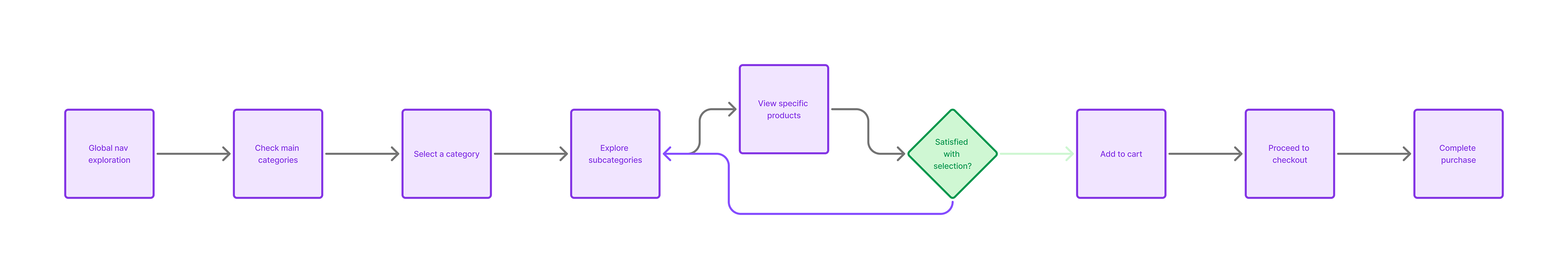
🧪 UX Wireflows
Global nav exploration
Trial flow from homepage to product
Unified product page wireframe

Header Design.
The Maxon header is a sticky, minimal top nav designed for clarity, speed, and product access across a growing creative suite.
Primary Nav Structure:
Clean, top-level links: Products, Try, Learn, Support, Company
Designed around user intent and stage in journey (e.g., discovery vs. help)
Mega Menu (Products):
Visual tiles for each product (Cinema 4D, Redshift, ZBrush, etc.)
Hover-based preview with icons and brief labels
Supports both first-time visitors and returning users
Functional Details:
Sticky behavior for constant access
Language switcher and account/login quick access
Fully responsive: condenses into hamburger on mobile with expandable panels
UX Considerations:
Keeps navigation consistent and visible across all pages
Optimized for fast scanning and decision-making
Balanced focus between product promotion and user support

Secondary Nav-Header

🏠 Home

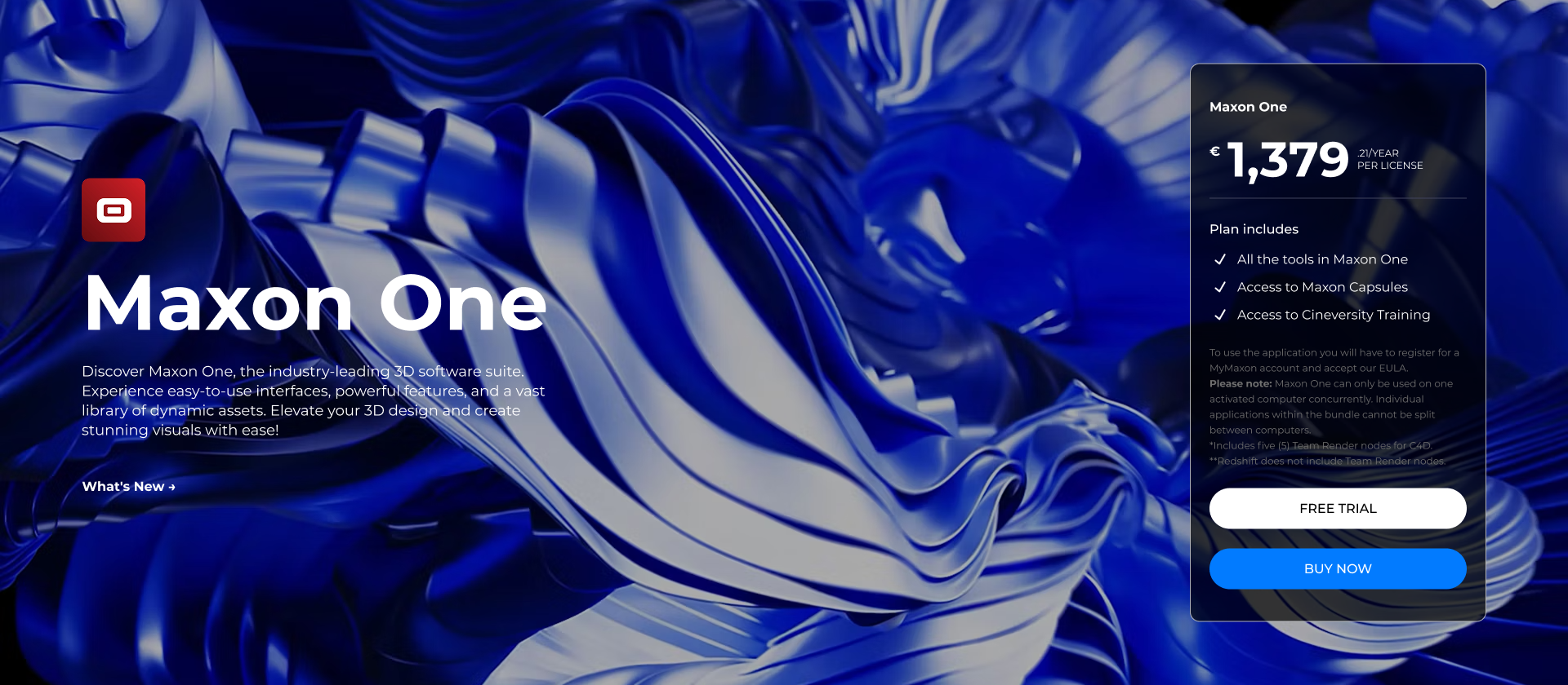
🏷️ Pricing Card Design:
🧩 Structure & Layout:
Title & Plan Name: Clearly labeled (e.g., “Maxon One”).
Price Display: Emphasized in bold (monthly or annual).
Feature List: 3–5 concise bullets, sometimes with icons.
CTA: Prominent “Subscribe” or “Start Trial” button.
Optional Tag: Labels like “Most Popular” guide decisions.
🎨 Visual Design:
Neutral backgrounds with strong brand-red CTAs.
Balanced typography for hierarchy.
Occasional card borders or highlights to distinguish tiers.
📱 Responsive:
Stacked vertical layout on mobile.
Buttons remain visible and thumb-friendly.
The design is simple, consistent, and conversion-focused — but could benefit from more visual hierarchy and emphasis on plan comparisons.

🎬 Cinema 4D Page – Design & Development Overview
The redesigned Cinema 4D product page was built to elevate the visual storytelling of Maxon’s flagship tool while streamlining the conversion journey.
Design Highlights:
Hero Section: Large fullscreen visuals with subtle motion, emphasizing C4D’s power and creativity.
Content Blocks: Modular layout showcasing key features (e.g., MoGraph, rendering, animation) using image-text pairs and anchored scroll navigation.
Interactive Modules: Embedded videos and animated previews to give users an immediate sense of the tool in action.
Pricing Card Integration:
Strategically placed after the core feature highlights.
Clean and bold design with clear pricing tiers for C4D or Maxon One.
Includes monthly and annual options, and a strong primary CTA (“Subscribe” or “Start Trial”).
Designed for responsiveness and conversion — sticky CTAs remain accessible on scroll.
Development Notes:
Built using a flexible component system for reusability across other product pages.
Optimized for performance, accessibility, and localization (multi-language support).
Seamless CMS integration for future content updates by the marketing team.
This page merges high-impact storytelling with functional clarity, driving both interest and subscription.

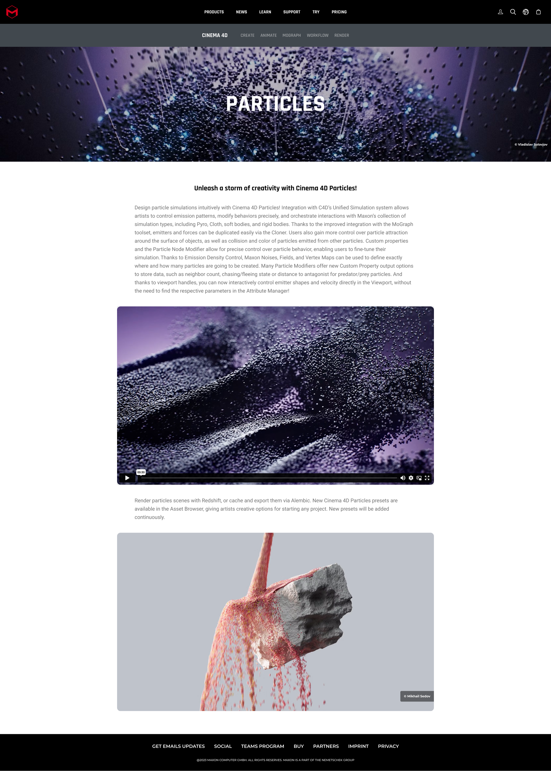
✨ Particles Update Page
As part of the seasonal release, we designed the Particles update page to showcase new features across Cinema 4D and Red Giant within the existing Maxon.net system.
Hero section with animated background highlights new motion capabilities
Modular layout reused Maxon’s UI system: image + copy + video blocks
Focused on clarity and scroll rhythm, guiding users through what's new
Linked feature updates directly to tools and CTA blocks for trial/download
Fully responsive, performance-optimized, and localized
Designed and built in close collaboration with product marketing and dev teams
Result: A high-impact release page that communicated complex features with visual ease and led users directly into the product flow.
🧑🎨 ZBrush Testimonials Section
we designed the ZBrush testimonials section to bring authentic artist voices forward, adding trust and community validation to the product experience.
Integrated within the ZBrush product page below core features
Designed as a horizontal scroll carousel with artist portraits, quotes, and tools used
Styled to match ZBrush’s bold, textured aesthetic while staying consistent with Maxon’s UI system
Mobile-optimized swipe interaction and keyboard-accessible for accessibility
Pulls dynamic content (quotes, names, social links) via CMS for easy updates
Goal: Build credibility by letting real artists speak — without disrupting the conversion journey.


🧪 Testing & Validation
Internal QA & usability testing across departments
Beta rollout in 2 languages before global launch
A/B tested landing page variations on high-traffic campaigns
📈 Results
(Use actual data if available. If not, format like this and fill later.)
+32% trial sign-ups within 30 days
+21% page depth on learning content
-45% support tickets about product downloads
Mobile bounce rate reduced by 17%
💡 Reflection
This project brought together design, strategy, and systems thinking at scale. I learned how to balance deep product complexity with user clarity — and how to elevate a visual brand while staying conversion-driven.
“This wasn’t just a website redesign. It was a reset for how users experience Maxon as a creative ecosystem.”