
🗂 Project Overview
Company : Maxon GmbH
Role: Lead UX/UI Designer
Scope: UX enhancements & UI refinements to improve clarity, efficiency, and transparency in license management.
Timeline: 2 months
Team: Lead UX Designer (myself), 1 UX designers, 1UI designer, 1 Product Manager, 2 Developers
Role: Lead UX/UI Designer
Scope: UX enhancements & UI refinements to improve clarity, efficiency, and transparency in license management.
Timeline: 2 months
Team: Lead UX Designer (myself), 1 UX designers, 1UI designer, 1 Product Manager, 2 Developers
🎯 Objectives
Improve usability of the licenses section with subtle but effective UI changes.
Enable better grouping and filtering of license data for administrators.
Provide visual cues for license expiry and assignment status.
Allow assignment of licenses both at the workstation and contract level.
🧪 Research
User (small studios) Interviews
Pain Points:
Too much manual checking for expired licenses.
No quick view of license usage per workstation.
Confusion about whether a license is already assigned.
Current grouping is ineffective for larger teams.
Heuristic Review
Inconsistent table formatting.
Lack of contextual filtering.
Poor visibility of important data like expiry or assignment status.
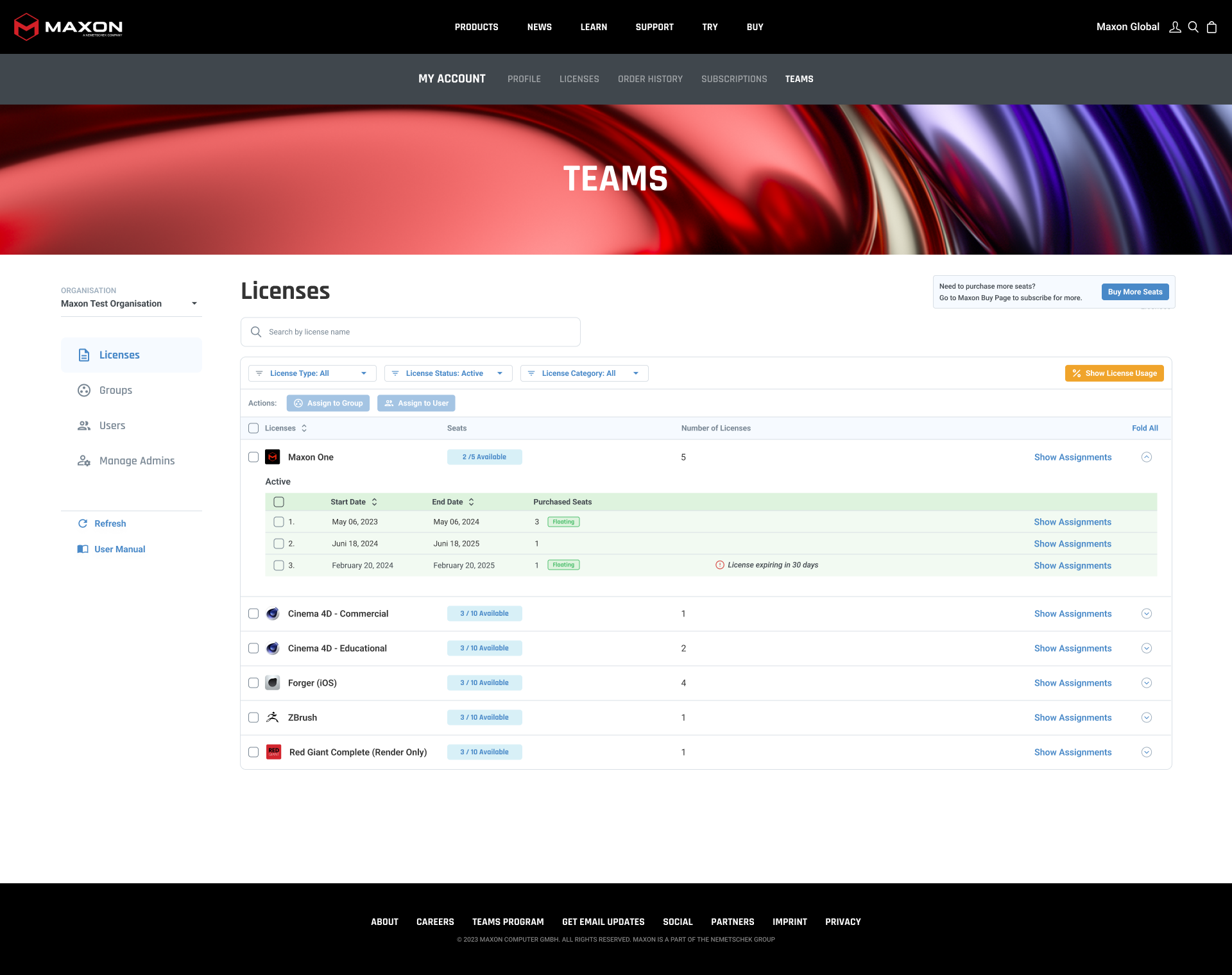
Grouping Contracts
All contracts are grouped under one license name

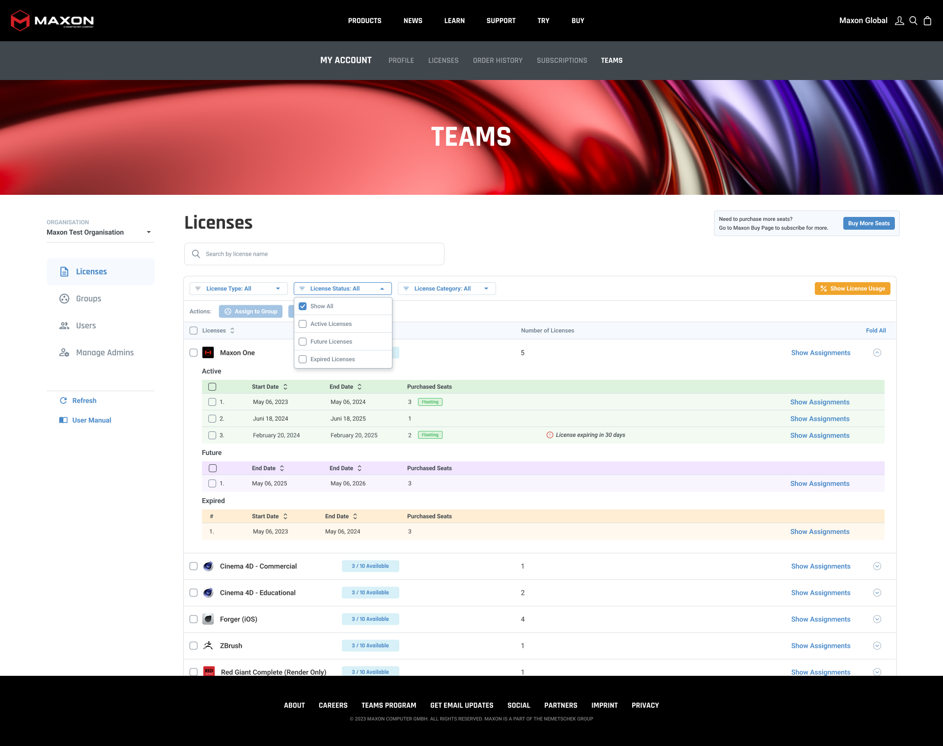
New Filter Added, old ones improved
New filter for workstation type is added, and all filters now have multiple selection logic


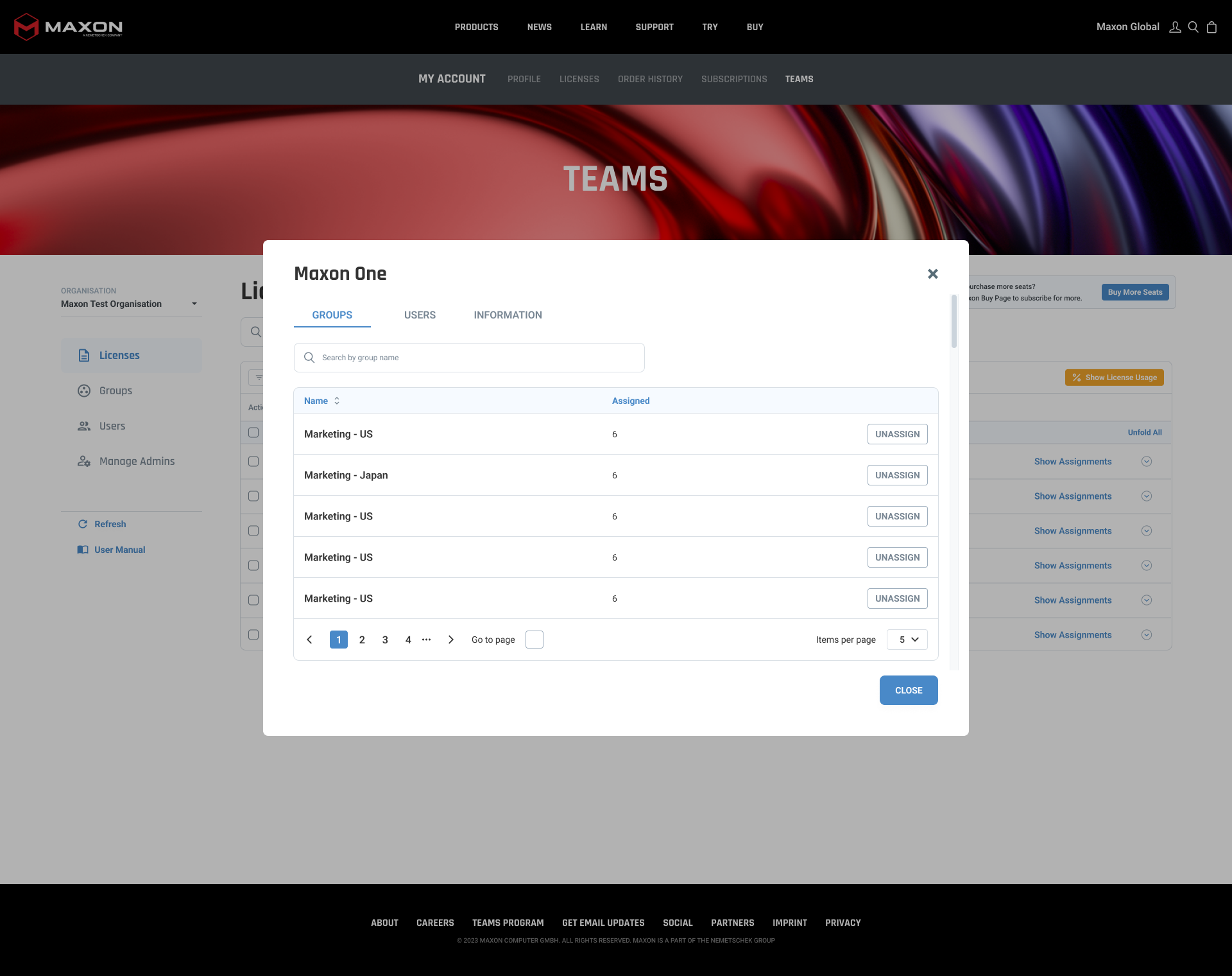
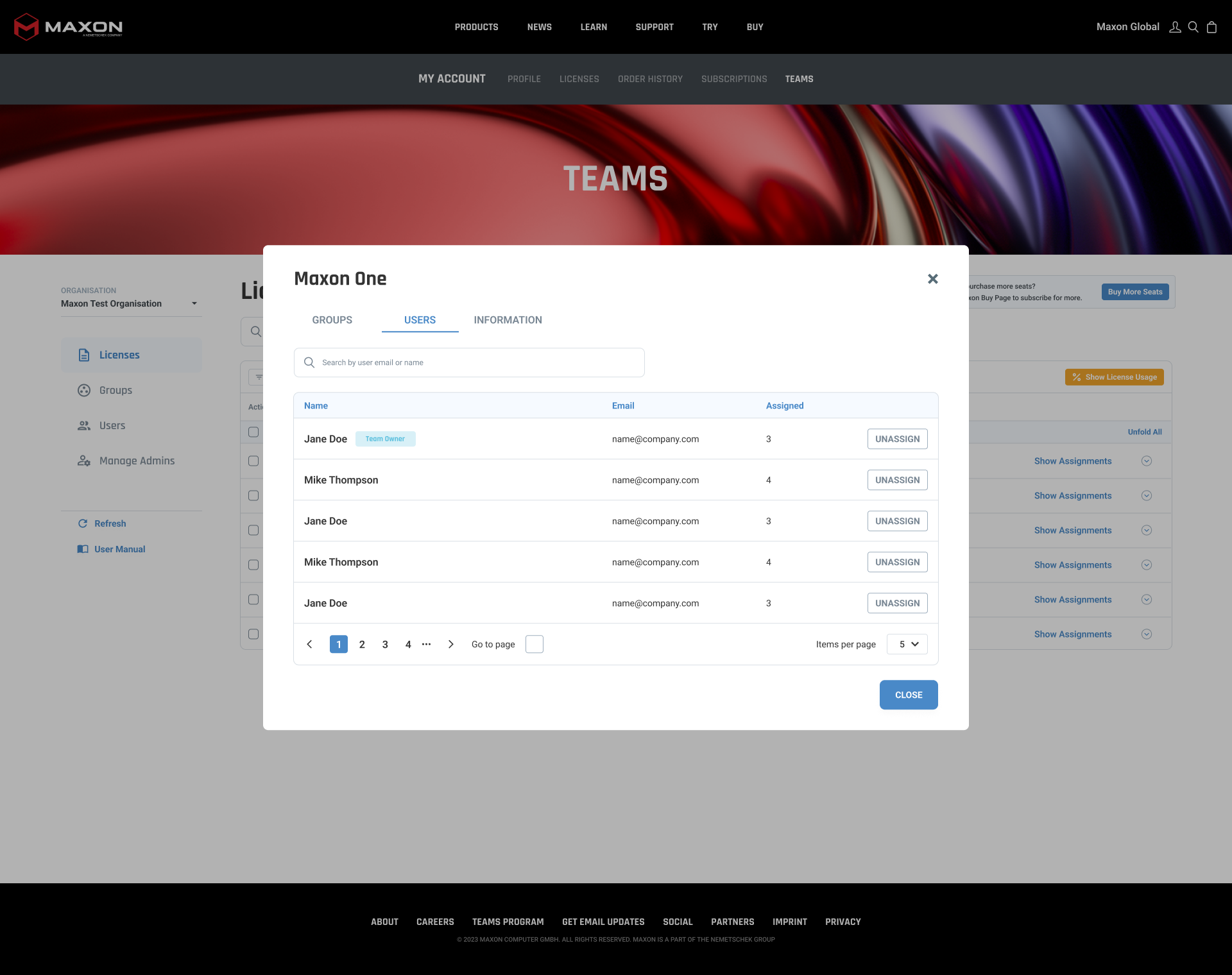
Assign License Modal: new Column Added
Column added inside the table to show if license is already assigned


unassign seats
When user wants to unassign seat, we want to show which seats are and which are not in use.

Logic
UI Rules:
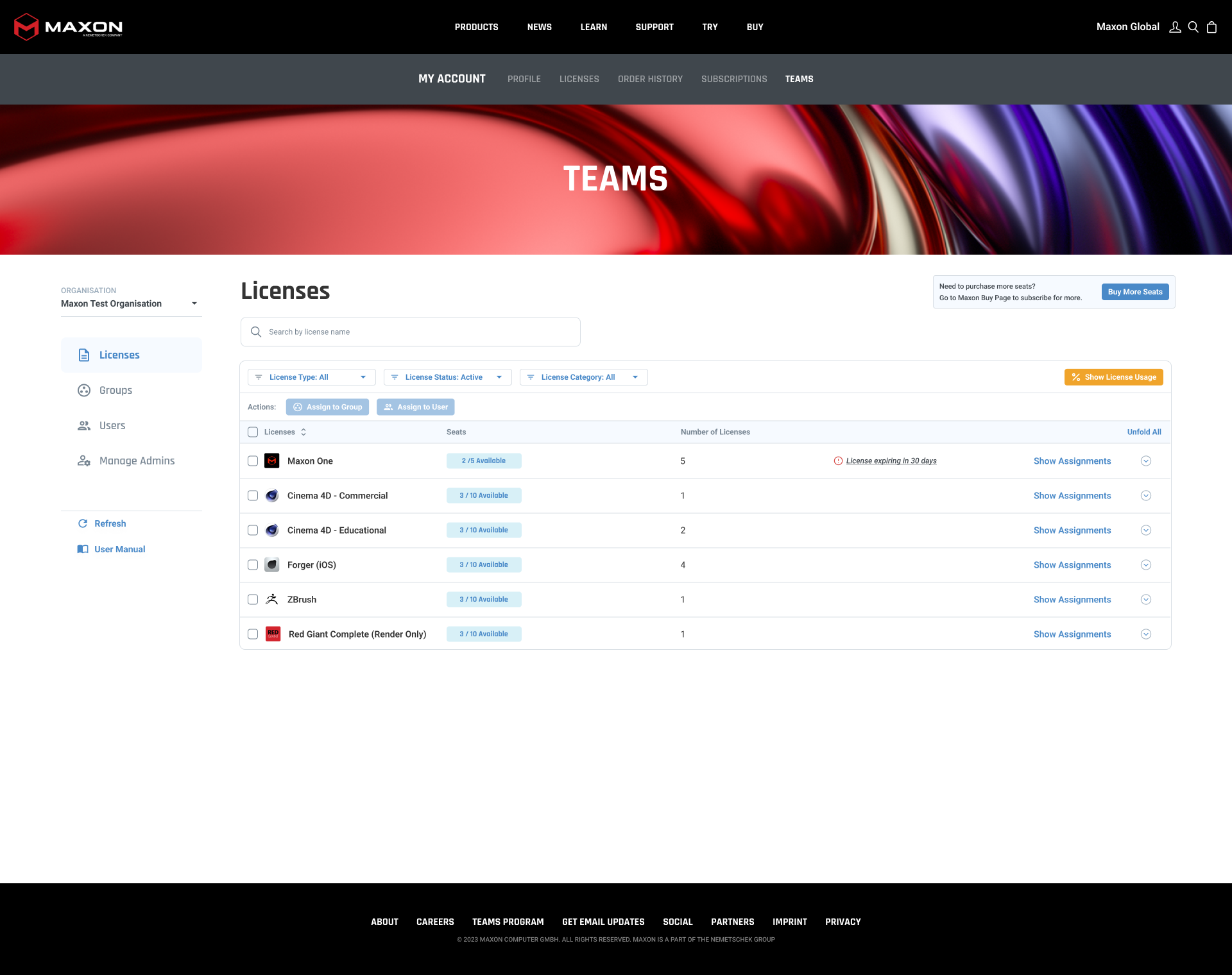
- Search by contract number means we show license which contains this contract number and we expand the row so contract is visible
-If we filter to show only expired licenses, we just keep those licenses with expired contracts and active+future gets hidden, same logic goes around if we filter to see only active or only future contracts
-”Number of licenses” column will be affected based on search and “Seats” column as well
-If we filter to show only expired licenses, we just keep those licenses with expired contracts and active+future gets hidden, same logic goes around if we filter to see only active or only future contracts
-”Number of licenses” column will be affected based on search and “Seats” column as well

UI Changes
1. Active tabs have different color (because they were looking like a buttons before)
Table columns heading: changed the color from blue to gray, so this way they don’t look like they are selected: for example like filters
Changed the buttons so they are a bit smaller and they are in lowercase - this way it’s easier for a user to read the text inside
Table columns heading: changed the color from blue to gray, so this way they don’t look like they are selected: for example like filters
Changed the buttons so they are a bit smaller and they are in lowercase - this way it’s easier for a user to read the text inside

🧪 Usability Testing
Format: 5 internal testers, scenario-based tasks
Results:
Results:
Time to locate an expiring license reduced by 60%.
100% success rate in filtering by workstation.
Confusion about license assignment dropped to 0%.
📈 Outcome
Clearer overview of license states.
Better support for large teams with many devices.
Reduction in support tickets about "missing licenses."
✍️ Reflection
This redesign project emphasized how small UI changes can create big UX impact. By aligning the table logic with user mental models and surfacing key information like expiry and assignment, we made the dashboard smarter without overcomplicating it.